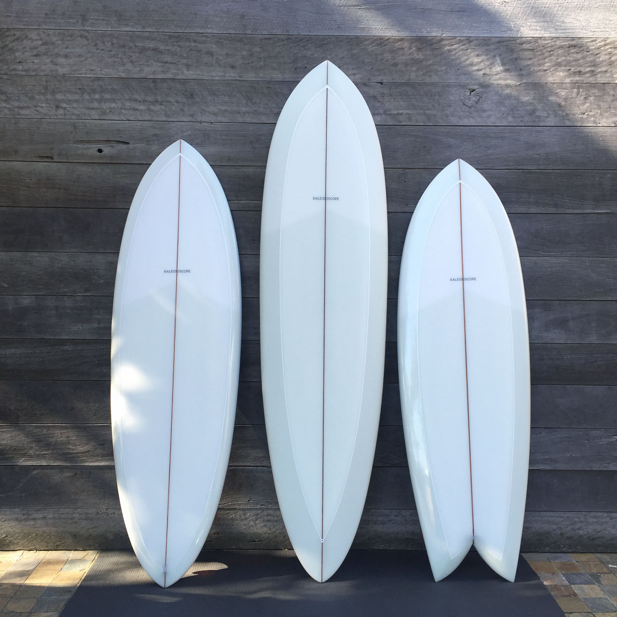
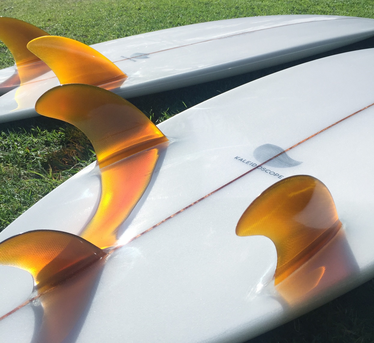
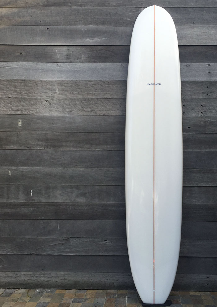
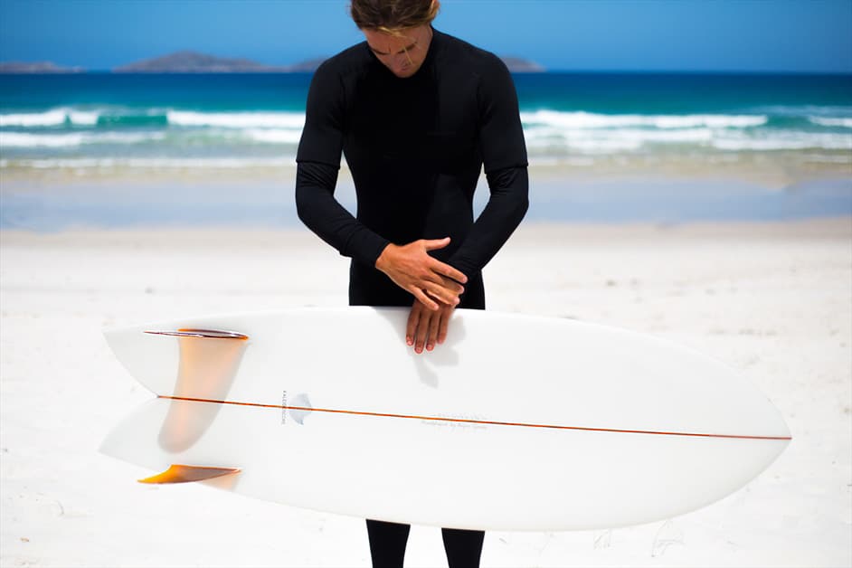
Kaleidoscope Surfboards are handmade works of clean lines and functional art made by a Byron Bay shaper whose focus is on crafting unique and customised boards made to meet the specific needs of each individual client. With a nod to traditional manufacturing techniques and a love for design and performance, Kaleidoscope needed a branding strategy that set them apart from the hyper competitive and oversaturated market of computer shaped cheaply made pop-outs.
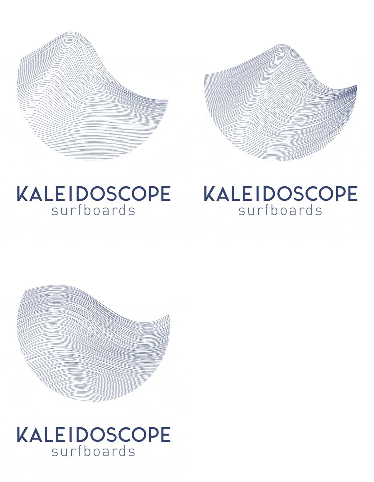
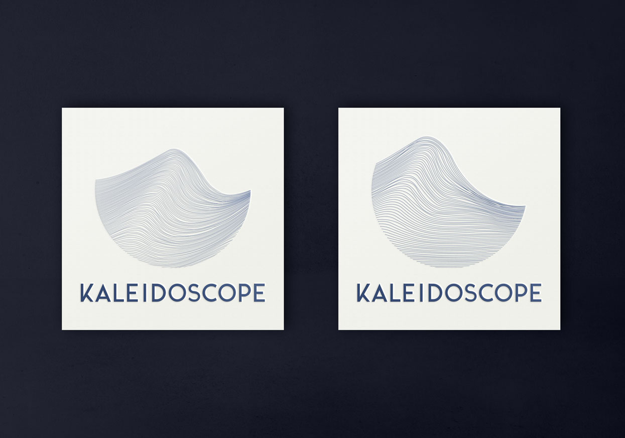
The strategy led us to a series of line work moulded into oscillating patterns that represent the varying moods of the ocean’s surface. The subtle differences in each logo tell the story of the sea, and of flux, and of the necessity to adapt to the ever-changing conditions that surfers face. It also speaks to the special, customised approach of the shaper, with the circle implying the desire for perfection, a journey toward the perfect board for the perfect wave
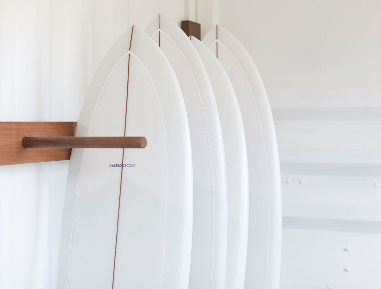
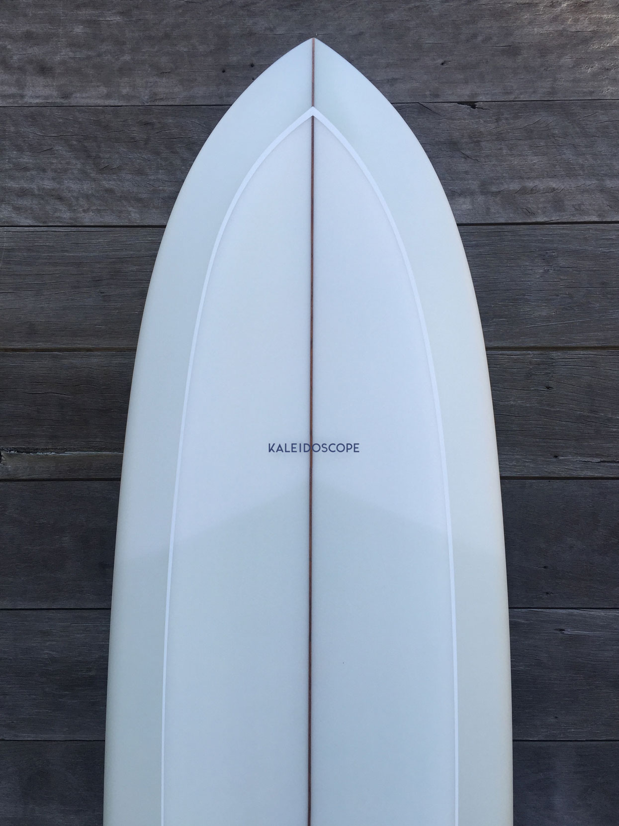
The blue is a deep navy and was designed to both symbolise the deep thinking process behind every board and contrast with the clean white foam. The end point is a simple and minimal aesthetic that appealed to the client allowing them to stray from the trend of large overbearing logos effectively turning surfboards into billboards on the beach.
